36-315 Project: A Close Look At Cincinnati & Covington
Aashna Singh .
Mei Kuo .
Nolan Carroll .
Wan Xin Teo .
Yijie Qiu
Barplot of Change in Population by Race
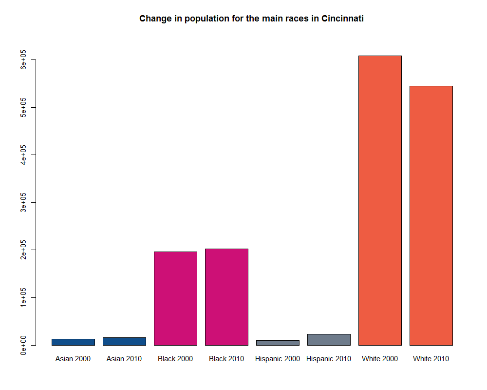
From the barplot, we can see that the population in Cincinnati is mostly white, and there is a substantial number of African Americans but a very small number of Asian or Hispanic. There seems to be an increase in the Asian, African American and Hispanic population while there seems to be a decrease in the population of whites. The decrease in the population of white seems greater than the combined increase in Asian, African American and Hispanic populations.
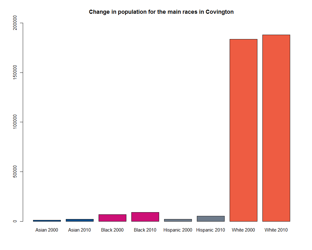
From the Covington barplot, we can see that the population in Covington is even more overwhelmingly white, and there is a much smaller proportion of African American, Asian and Hispanic population. In contrast to the Cincinnati barplot, we see that there is an increase in population for all races.
1
Race Distribution Percentage
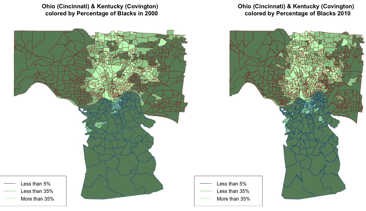
For the plot, the red border represents the Cincinnati tracts and the blue border represents the Covington tracts. In general, looking at both plots, we can see that Covington in general has less than 5% African Americans for most tracts whereas for Cincinnati, there are many tracts in the middle where there is a larger presence of African American population. There is an increase in the number of tracts with more than just 5% of population being African American for both cities, but it is more apparent in Cincinnati. These tracts that saw an increase in percentage of African American still tend to be in the middle of Cincinnati, but the area is greater (spreading to the left and right of the original area in 2000 where there was a larger presence of African American community). However, this spread in African American community is larger to the right of the plot compared to the left as we can see more tracts with greater than just 5% African American to the right of the plot. In Covington, the tracts that saw an increase in African American population to more than 5% tend to be closer to the border shared with Cincinnati and it is in the center of the border.
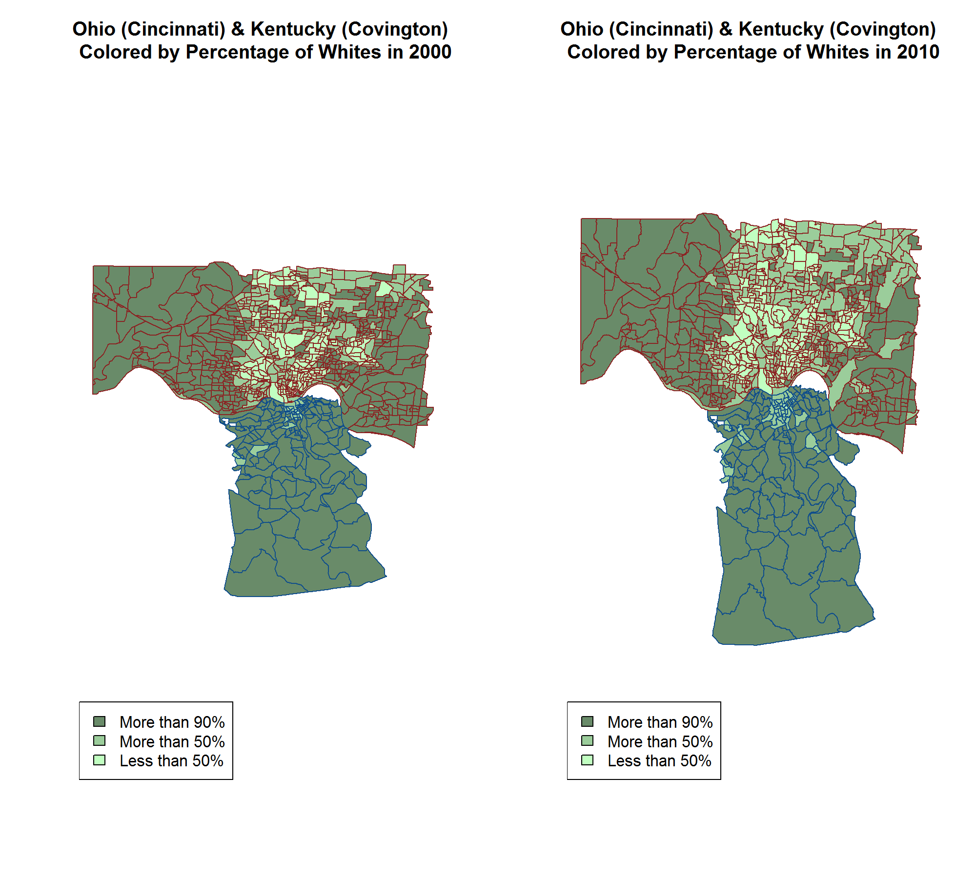
For the plot, the red border represents the Cincinnati tracts and the blue border represents the Covington tracts. In general, looking at both plots, we can see that Covington in general has more than 90% whites for most tracts whereas for Cincinnati, there are many tracts in the middle where there is below 90% whites. There is a decrease in the number of tracts with more than 90% of population being white for both cities, but it is more apparent in Cincinnati. The tracts in the top right hand corner have generally 50-90% of whites in 2010 compared to mostly having more than 90% whites in 2010. While Covington has a few tracts that saw percentage of population being white drop below 90%, it happened in the tracts nearer to center of Cincinnati (where there are more tracts with lower percentages of whites).
2
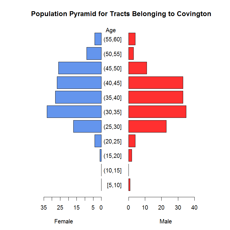
Population Pyramid of Age
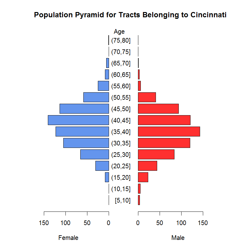
The population pyramid of Cincinnati shows that the largest median female age group is between 40 to 45 years old, as there are about 150 tracts in the group. The largest median male age group is between 35 to 40 years old, as there are also about 150 tracts in the group. The distributions of median age of both female and male in Cincinnati are like bell-shaped. There is less younger and elder generation in Cincinnati for both female and male. The range of median age in Cincinnati is from 5 years old to 80 years old. Compared to that of Cincinnati, the largest median age group is between 30 to 35 years old for both female and male in Covington. In addition, the range of median age spans from 5 to only 60 years old, meaning that the population in Covington in general is younger than population in Cincinnati.
The population pyramid of Cincinnati shows that the largest median female age group is between 40 to 45 years old, as there are about 150 tracts in the group. The largest median male age group is between 35 to 40 years old, as there are also about 150 tracts in the group. The distributions of median age of both female and male in Cincinnati are like bell-shaped. There is less younger and elder generation in Cincinnati for both female and male. The range of median age in Cincinnati is from 5 years old to 80 years old. Compared to that of Cincinnati, the largest median age group is between 30 to 35 years old for both female and male in Covington. In addition, the range of median age spans from 5 to only 60 years old, meaning that the population in Covington in general is younger than population in Cincinnati.
3
Median Income Distribution

Combining Cincinnati and Covington with color in median income level, we see that the median income level is higher in Covington than that in Cincinnati. We color the median income in three colors, representing the minimum, median and maximum of the median income level in both cities. Covington in general has a median income level higher than 63,980 dollars while Cincinnati has a median income level around 10,830 dollars. Since we know from the previous race distribution plots above that Covington has a larger percentage of white population than Cincinnati does, we would expect the median income in Covington is higher than that in Cincinnati due to differences in racial distribution.
4
Income Distribution vs. Percentage of Population
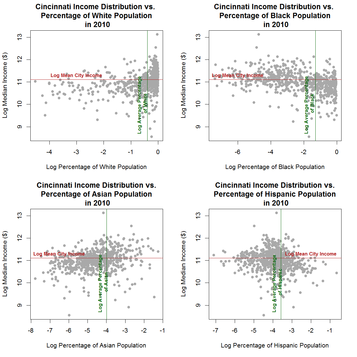
The following four plots all look at the relationship between income distribution and percentage of ethic population group including White, Black, Asian and Hispanic in Cincinnati. The first plot on the top left shows an increasing trend in median income as the percentage of White population increases. At a higher percentage of White, the percentage of White population that generates incomes higher than the mean city income increases. The second plot on the top right shows that there is a decreasing trend between median incomes and percentage of Black population. As the percentage of Black population increases, more percentage of population has a median income below the mean city income level. The third plot on the bottom left does not show a slight increasing trend between median incomes and the percentage of Asian population. Most of the Asians’ incomes are around the mean income level but some of Asians’ incomes are relatively lower than the mean income level. However, as the percentage of Asian population increases, the levels of income seem to be increasing. The fourth plot on the bottom right shows a decreasing trend between median income and percentage of Hispanic Population. As the percentage of Hispanic population increases, more people have income level below the mean city income.
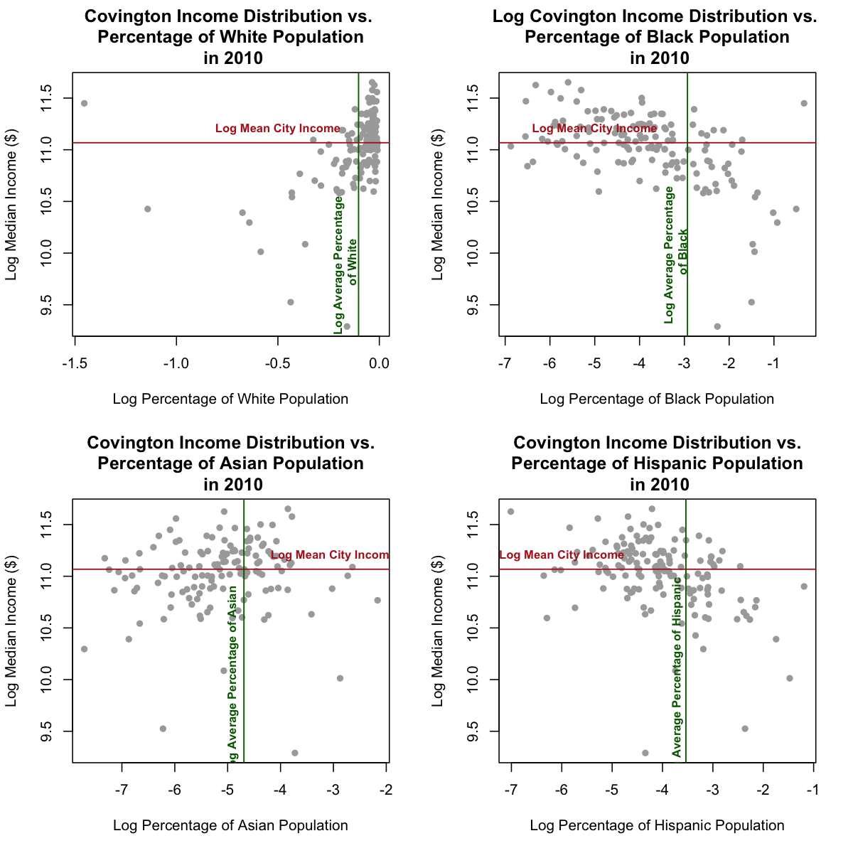
The following four plots all look at the relationship between income distribution and percentage of ethnic population group including White, Black, Asian and Hispanic in Covington. The first plot on the top left shows an increasing trend in median income as the percentage of White population increases. At a higher percentage of White, more population has a higher income above the mean city income level. The second plot on the top right shows that there is a decreasing trend between median incomes and percentage of Black population. As the percentage of Black population increases, more population of Black has a median income below the mean city income level. The third plot on the bottom left does not show an apparent trend between median incomes and the percentage of Asian population. Most of the Asians’ incomes are around the mean income level but some of Asians’ incomes are relatively lower than the mean income level. The fourth plot on the bottom right shows a decreasing trend between median income and percentage of Hispanic Population. As the percentage of Hispanic population increases, more people have income level below the mean city income.
5